


All from love, not domination
Could you imagine?

Could you imagine a world where everyone in power pulled forth all of their actions from a foundation of love, rather than a desire to dominate?
I write at this moment, holding all of the violence happening in the world, especially overseas, with the sincere attempts to shuttle, or sailboat, love to it.
A big part of my personal journey has been confronting the fear of being in any form of power, because of the conditioning of my perception around power and harm. It seems that power and harm are so inextricably joined that I couldn’t ever feel comfortable having power, because it must mean I would certainly cause harm.
But that is too strict of an assumption from limitations in the mind.
~ ~ ~ ~ ~
Palette of the Month Solar Return
This is my last formal transmission for Palette of the Month in its current form, my year long project of deep dives into natural color, for my paid Substack subscribers. However, I am making it public. Stay tuned for why and what is next at the bottom of this post!
It has been one year now of this project, and it has returned full circle from the same connection that sparked it.
A few months ago, pigment ceremonial artist and educator (and someone who I have learned a lot from) Tilke Elkins made a call out to their newsletter subscribers with an offering to send a pigment or two to anyone who requested one. The generous spirit of the request-for-requests was this: if you feel moved toward a particular pigment or color, tell me, and maybe I can give that to you.
I didn’t respond. I was too hesitant. Not until the next newsletter where it was revealed that NO ONE MADE A REQUEST.
Ok, I’ll do it.
I remembered the instructions:
“give me a color or a pigment name, or even, a description of a feeling you would like to have in the presence of a pigment. send me as much description or as little as you like and i will use intuition & practicality to locate some pigment and mail it your way. i'll get as close as i can.”
This is what I sent:
Here are some cryptic words that surround my current experience of personal growth, and I have no expectation for what emerges, but maybe a pigment will stir forth...
Fierce
Confidence
Truth
Power
Service
All from love, not domination
◯
That was all I said.
I have been thinking about fierce goddess energy. Love so fierce, not for harm, but for truth and good. I know people like this, the fierce goddesses in my life. Some are real humans and some are cosmic energies, metaphors, and voices underwater in dreams. You probably know some fierce goddess people too. It’s very clear their personal power runs on love. This breaks my conception of the indivisible power-harm certainty. It dissolves my structured reality a bit, heals the ego, destroys illusion.
This is the part where it is worth mentioning here that I entered Sade Sati earlier this year, a 7.5 year period according to Jyotish astrology where Saturn transits over the zodiac sign before, of, and after one’s moon sign. This time is said to be a time of deep internal restructuring… to say the least.
So.
Disciple of Saturn and disciple of truth, I am a guaranteed hard worker in the moment I am (and we are) in, to discover how power can be safe, and enable one to responsibly serve from deep love. And I’m grateful that one method for this exploration includes collaboration, intuition, and wild, earthen color.
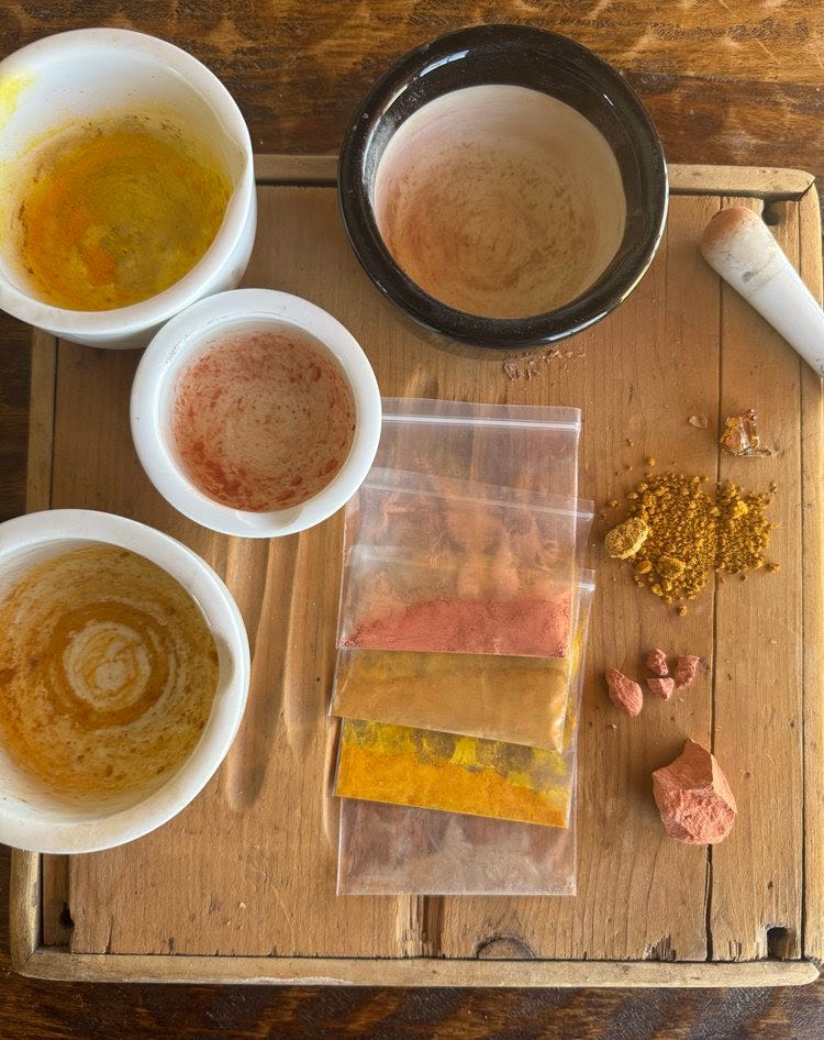
The pigments I received
When I received a brown envelope in the mail I couldn’t wait to see what was inside, and I was shocked to pull out not one but four little parcels!
From top to bottom:
Power and service. A brilliant pink ochre. An iron oxide that was passed down to Tilke by other pigment friends. The origin is listed as “somewhere in Utah”.
Fierceness and confidence. A rich yellow ochre gathered from an abandoned aluminum mine on Kalapuya lands.
Gamboge. This is a new one for me. This is a resin from a tree in Cambodia. It’s a little precarious and internally toxic (will cause severe digestive upset if consumed…) This gamboge is super vibrant. To me, it expresses responsibility. I love that if used incorrectly, it will cause harm, but if used correctly, such as combining with other colors, it will greatly influence the vibrancy and beautiful transformation of the other color. I was told if it collaborates with blue, for example, the most brilliant green will emerge.
Choke cherry sap from Kalapuya lands. This can be used as a paint binder for the pigments.
The Greatness of Iron
Last night, I finished reading the book “The Greatness of Saturn”, a ‘therapeutic myth’ told and retold which explains Saturn’s role in spiritual growth. Vedic astrology describes each graha (in this context, planet) with an affinity for a particular metal, and Saturn’s favorite metal is Iron.
Whenever I think about Iron I am brought back to how visceral it felt to read a different book, “Book of Earth” by Heidi Gustafson, a year or so ago. I remember her descriptions of and reverence for Iron and all of its connections to ancient ancestry, ritual, and regeneration. I am a firm believer that everyone should read this book.
When I am with these Iron oxides it feels as though I am in closer relationship with Earth, but also all of which surrounds Earth. In the body, but also in the etherial.
Iron in the sky, Iron in the ground, Iron in the body, Iron beyond.
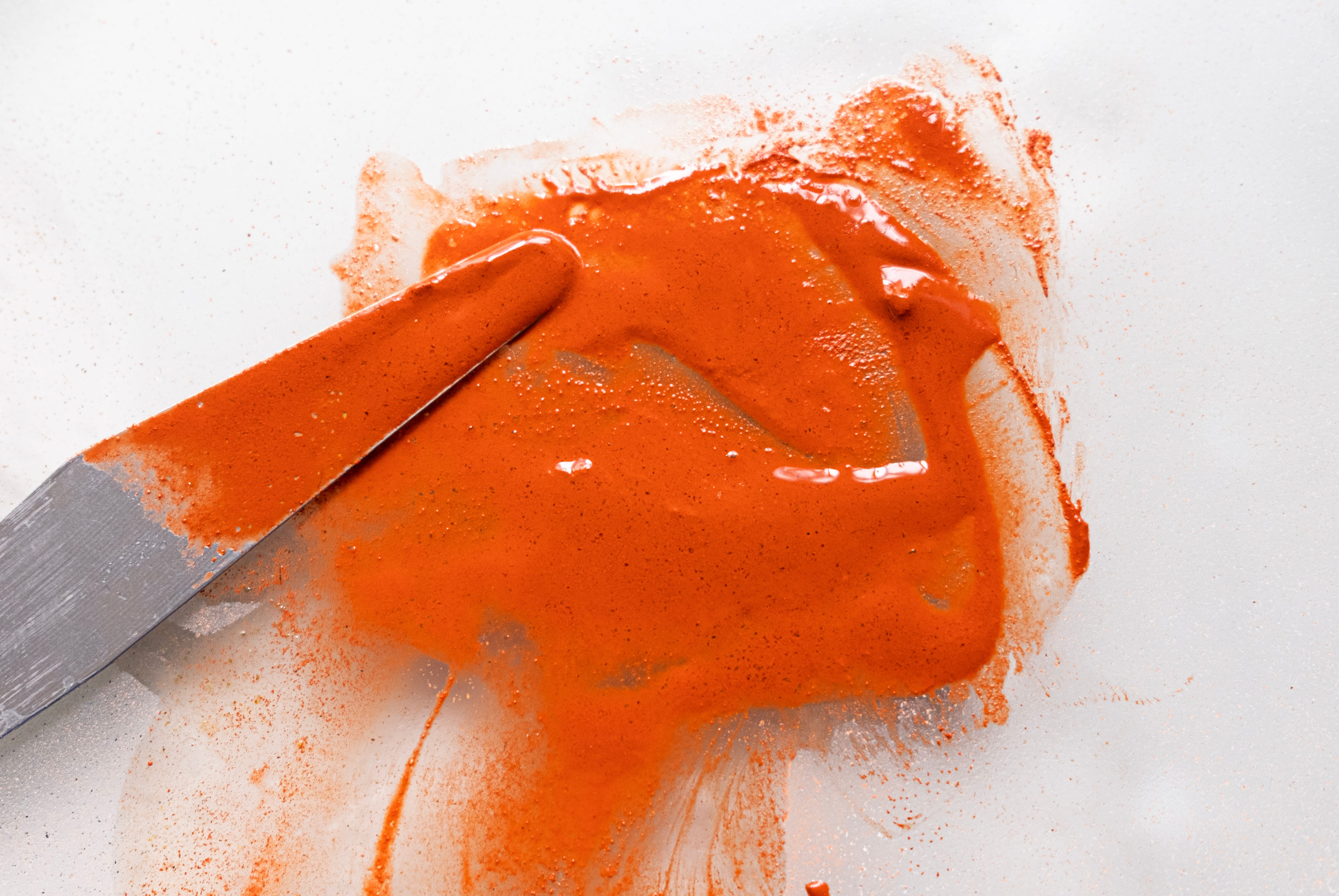
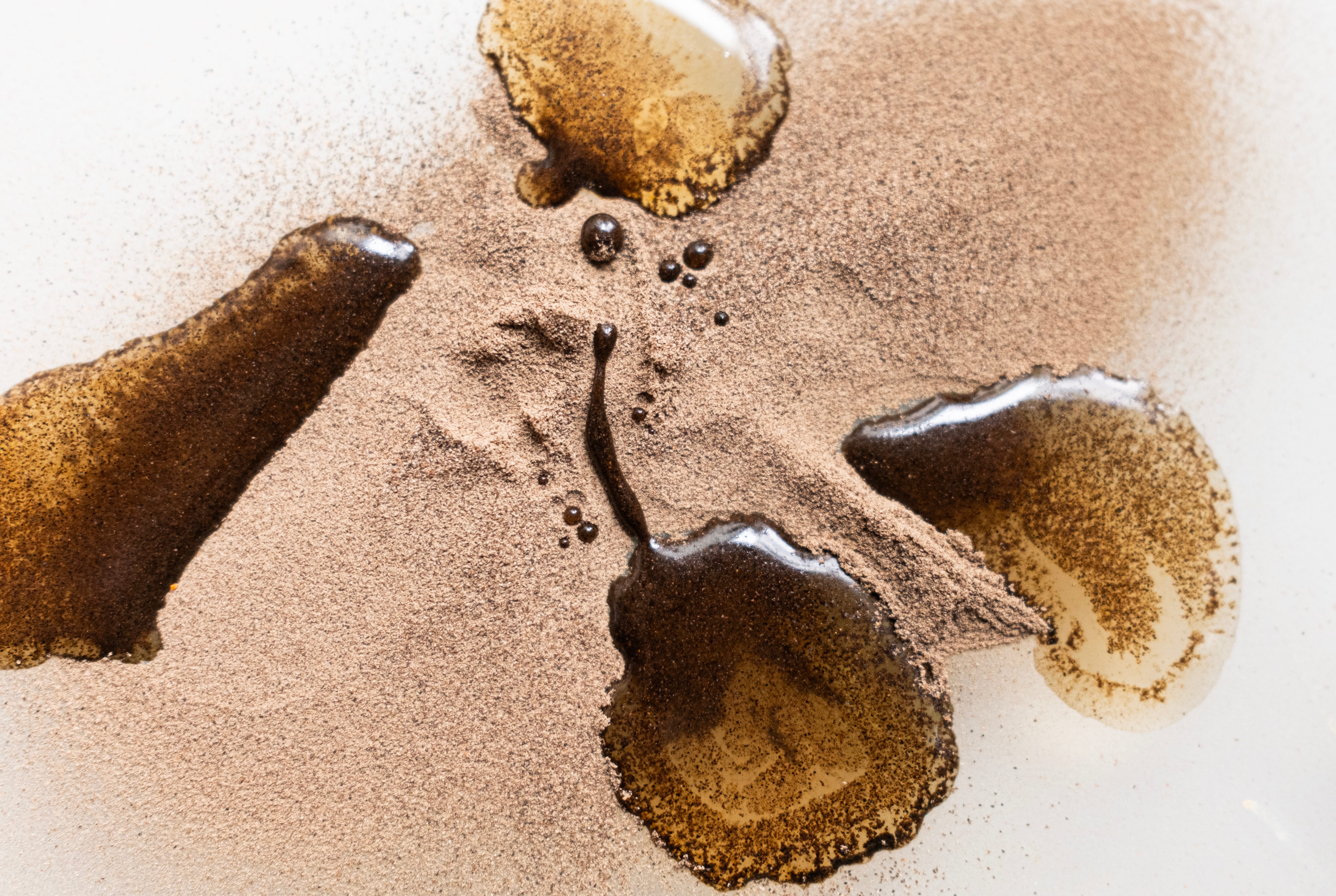
Red is not the favorite color of Saturn, by the way. Saturn likes sapphire blue and black. You will see that I have added black to my palette at the end of this post for this reason. For now, we can see that different forms of oxidized Iron can offer a whole rainbow of color. Reds and yellows are the most common expressions. Above is the ‘pink’ ochre pigment that has turned quite red once combined with the element of water, and sap binder.

And here is the yellow ochre. You can see the edges here where the dust is touching some wet parts of the mulling plate, deepening the value. This color becomes a little more dull and orange-ish once combined with the binder. Especially compared to the next one…
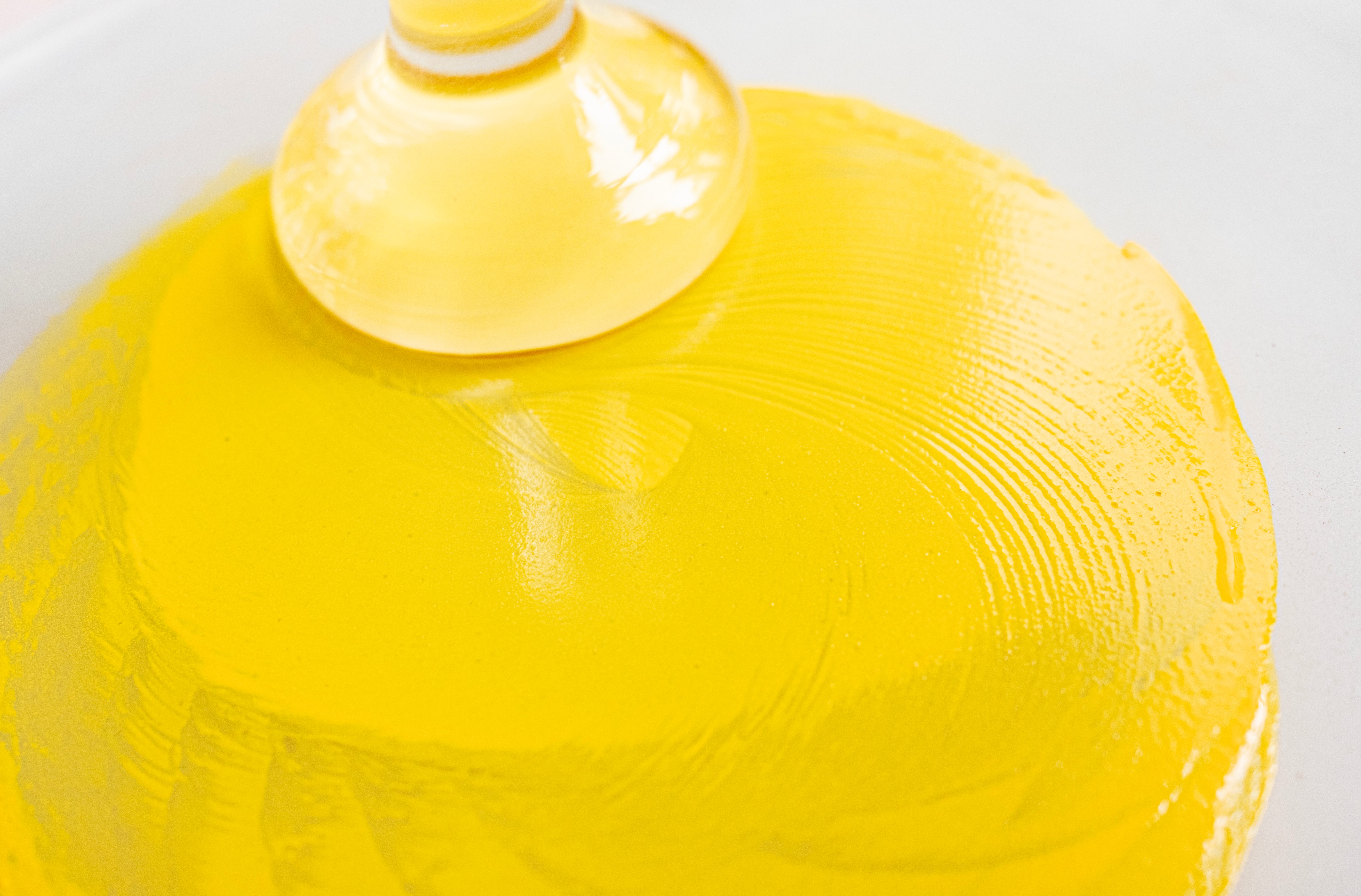
Alas, the Gamboge. This striking yellow reminds me of both dandelion petals and stomach bile! Innocent comfort or sharp acidity? It depends on how you look at it. A Rorschach of color. What do you see?
In fact, all of these above colors are lovely but a bit sharp and acidic, the kind of fierceness that isn’t always easy to harness the comfort and rightful purpose in.
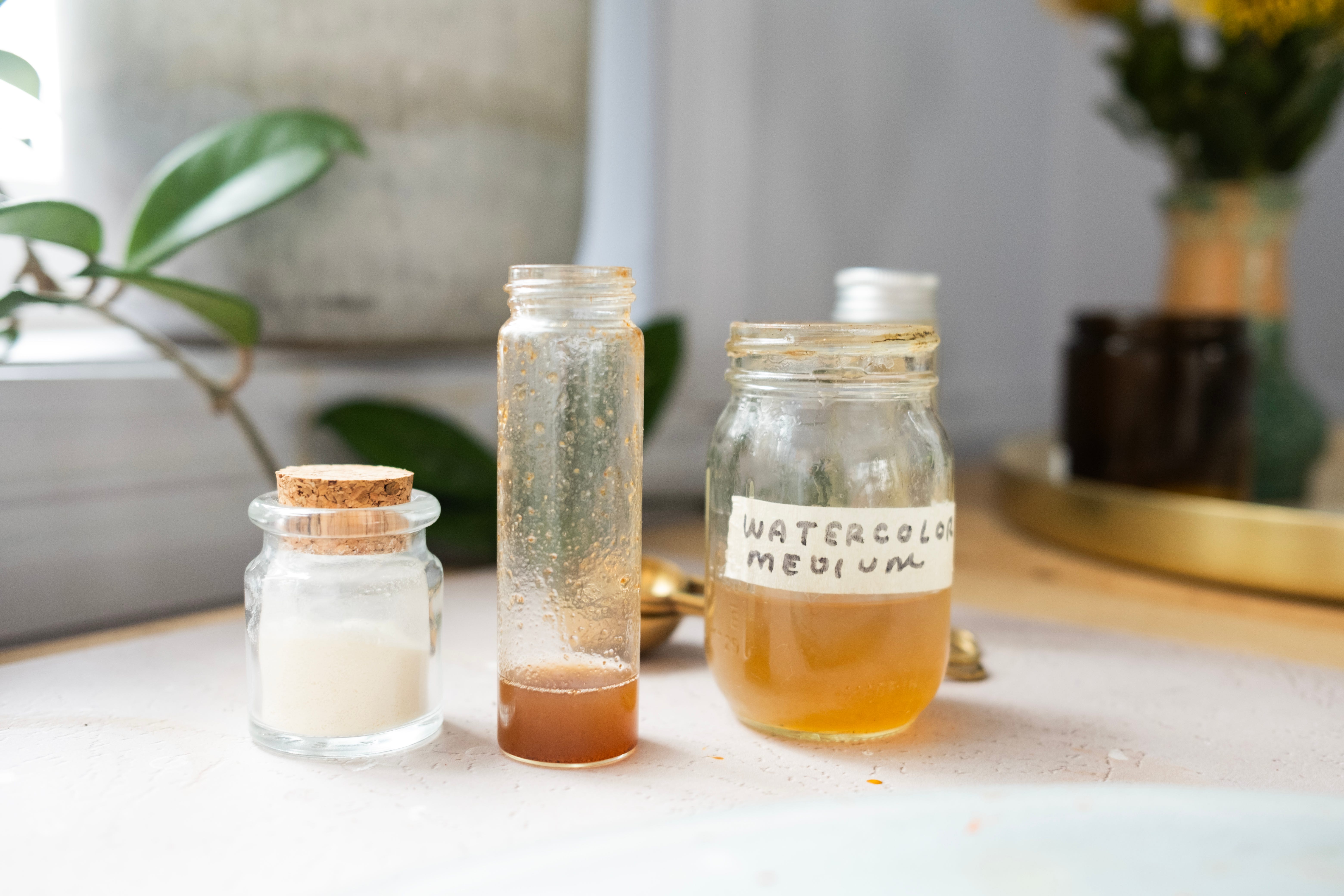
The palette container I was using has a few extra slots. To round this out, I added some incense ash paint. This is one of my favorite paints to make, because all I need to do is burn incense to amass the brown pigmented ash. This paint contains the elements of fire, air, and space, along with the attitude of ritual, and the earthly scent.
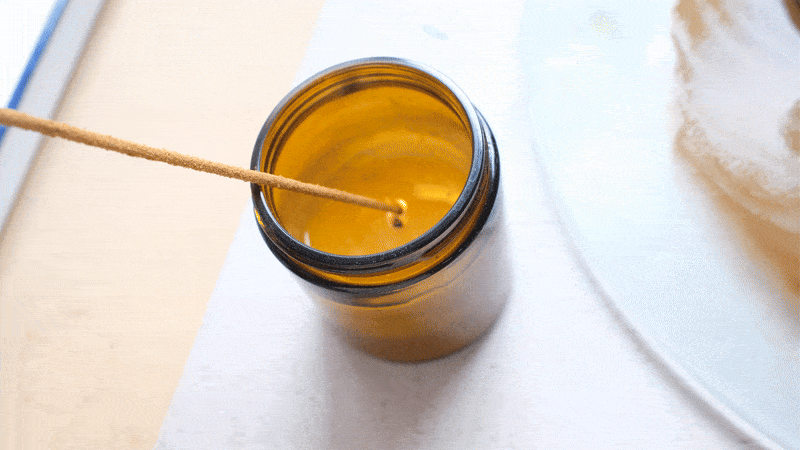
The only missing element is water.
There, I fixed that problem!
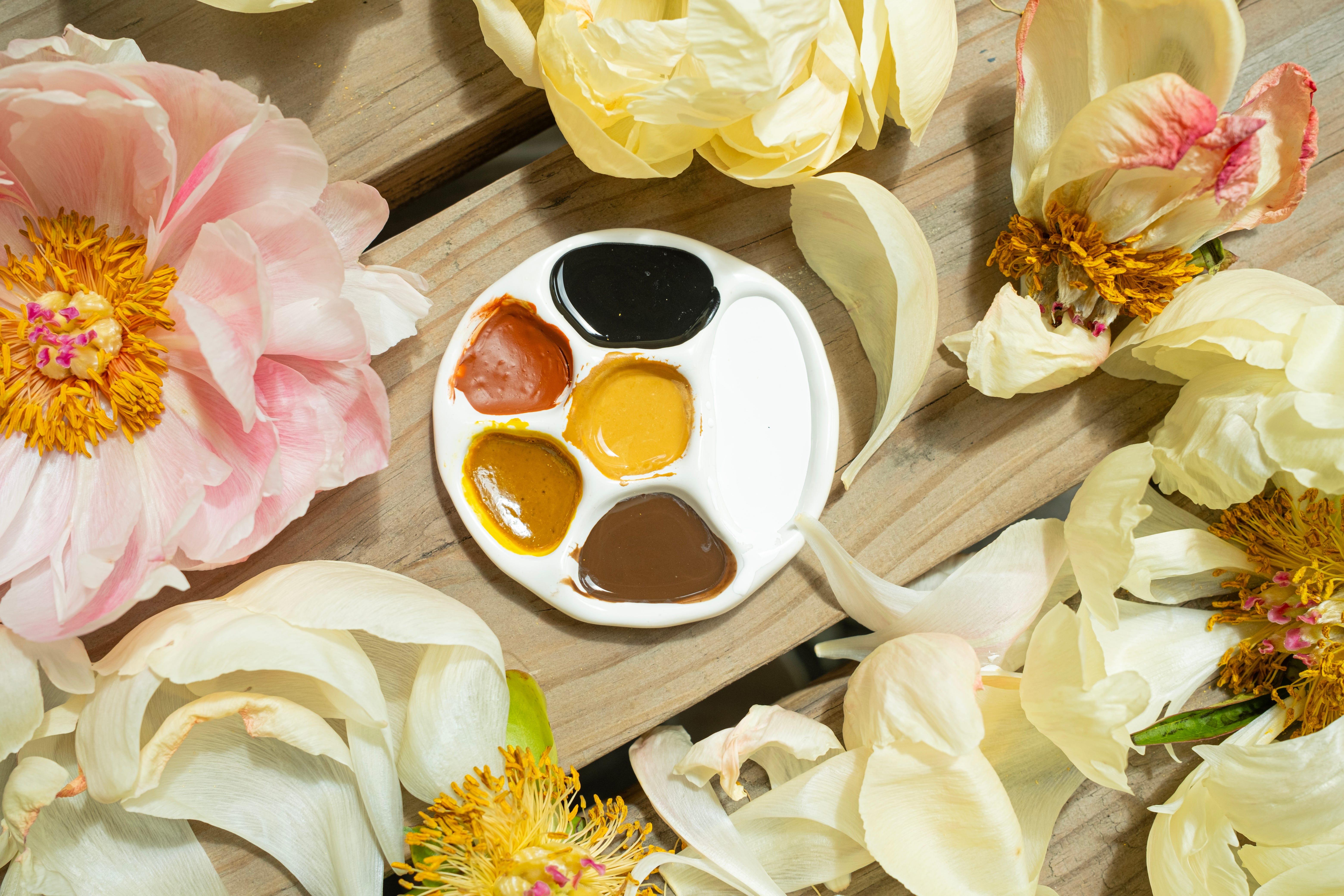
This introduces the last color in my palette - titanium white.
I decided I needed some conscious softness. When I paint with this palette, I will have the option to soften anything. Softening as intention. Combining soft with fierce. For harmony. For love.

My resulting paint palette
The colors here will travel with me to my residency next month. I may or may not use them, but it will be nice to have some paints with me, as I am not sure if I will be doing any paint-making while I am there. I may meditate with them, or I will use them. I have a strong feeling that I will be using the colors red and black, not my usual MO, but neither is feeling comfortable in my own strength.
I am in the process of knowing the wide extent to which love can guide.
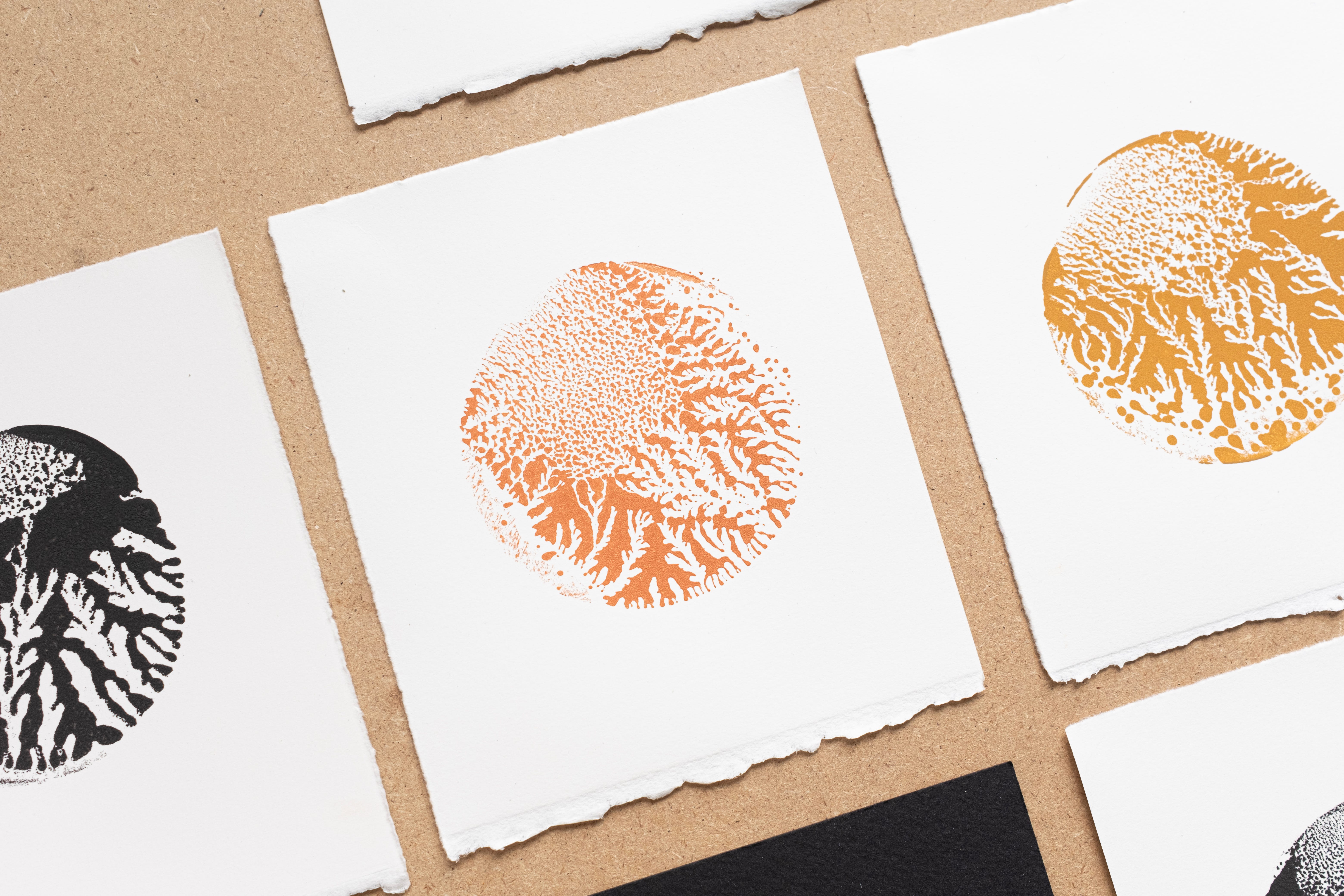
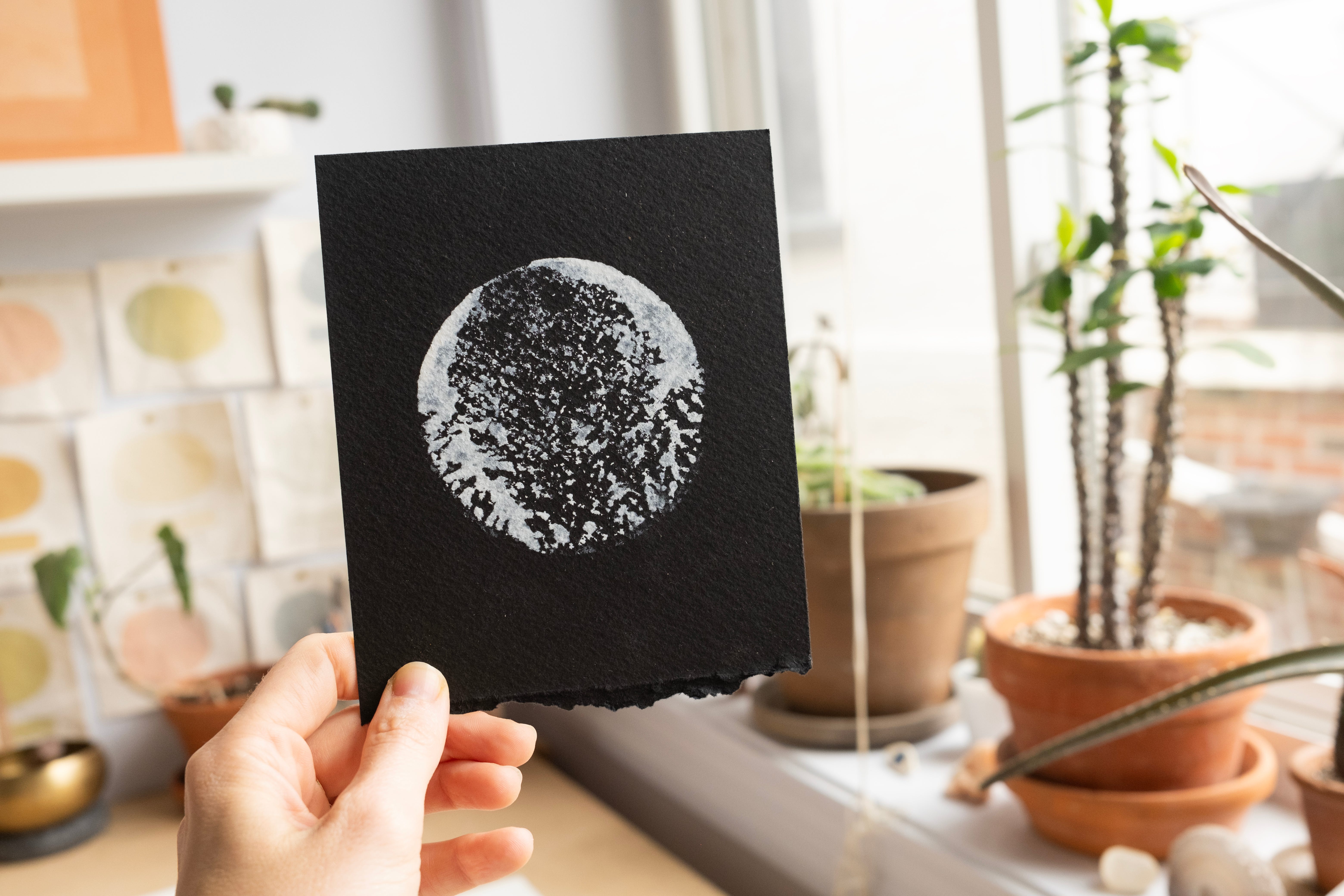
Mono prints, for you!
To celebrate one year of this project, I am doing something a little different.
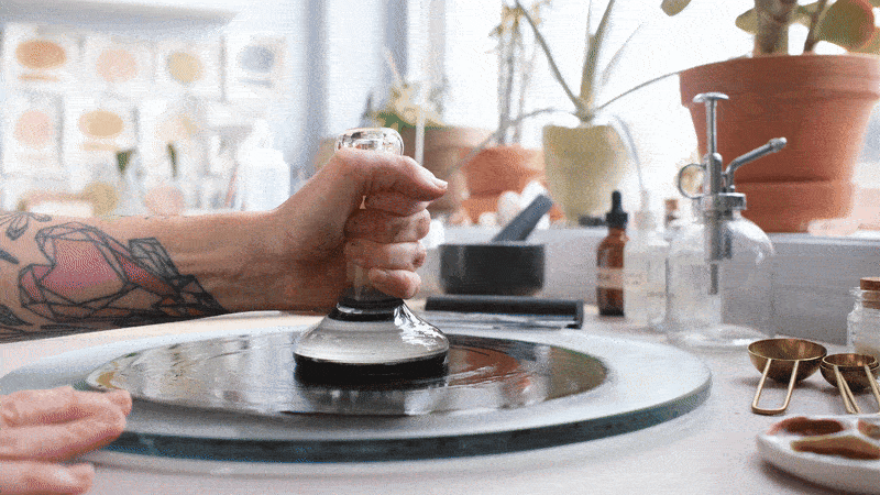
When paints are being mulled, something magical happens when the muller is lifted off of the spread of paint. All of this feathering occurs. It reminds me of roots, ferns, and coral…
I have begun making mono prints from the muller with the paints I create. This is done by lifting the muller from the paint, and then stamping it onto paper. I made (yet another!) GIF showing the whole process below! Expect more process gifs in future posts. I’m sort of obsessed.
Each mono print is unique. Actually, that is what a mono print is!
Reply here for a free mono print
While supplies last! If you are a paid subscriber, you get first dibs. Simply reply here (or email me at kristendroz@gmail.com) if you would like one. Include your mailing address, and you will receive a randomly chosen paint-making mono print mailed to you.
I love that they look like moons, or planets…
What’s next:
I have decided to remove the paywall on my future posts. I tried the paid subscriber exclusive, and I am so grateful for those of you who have become paid subscribers! Thank you so much. You have no idea how supportive that feels to me and my art practice. It really makes a difference. I realized that my attitude toward paid subscriptions is shifting back to something more centered on generosity, joy, and support rather than something explicitly exclusive and transactional. I welcome any thoughts and feedback from you about this.
Here is how it is going to work:
I am going to continue to pour myself into meaningful writing, creative how-to’s, encouragement, natural material recipes, and of course there will still be many pigment deep dives. It is going to be more organic now, and if you choose to become a paid subscriber you will still be eligible to have first dibs on giveaways for paintings (or mono prints) like this one.
Whether you choose to keep (or start) your paid subscription or not, I look forward to continuing to write to you, and share about creativity as a means for deep self-discovery.
With love,
♡ Kristen